A Type History of Aurebesh
how much thought is put into the typefaces of a made-up writing system from Star Wars?
…turns out a lot!
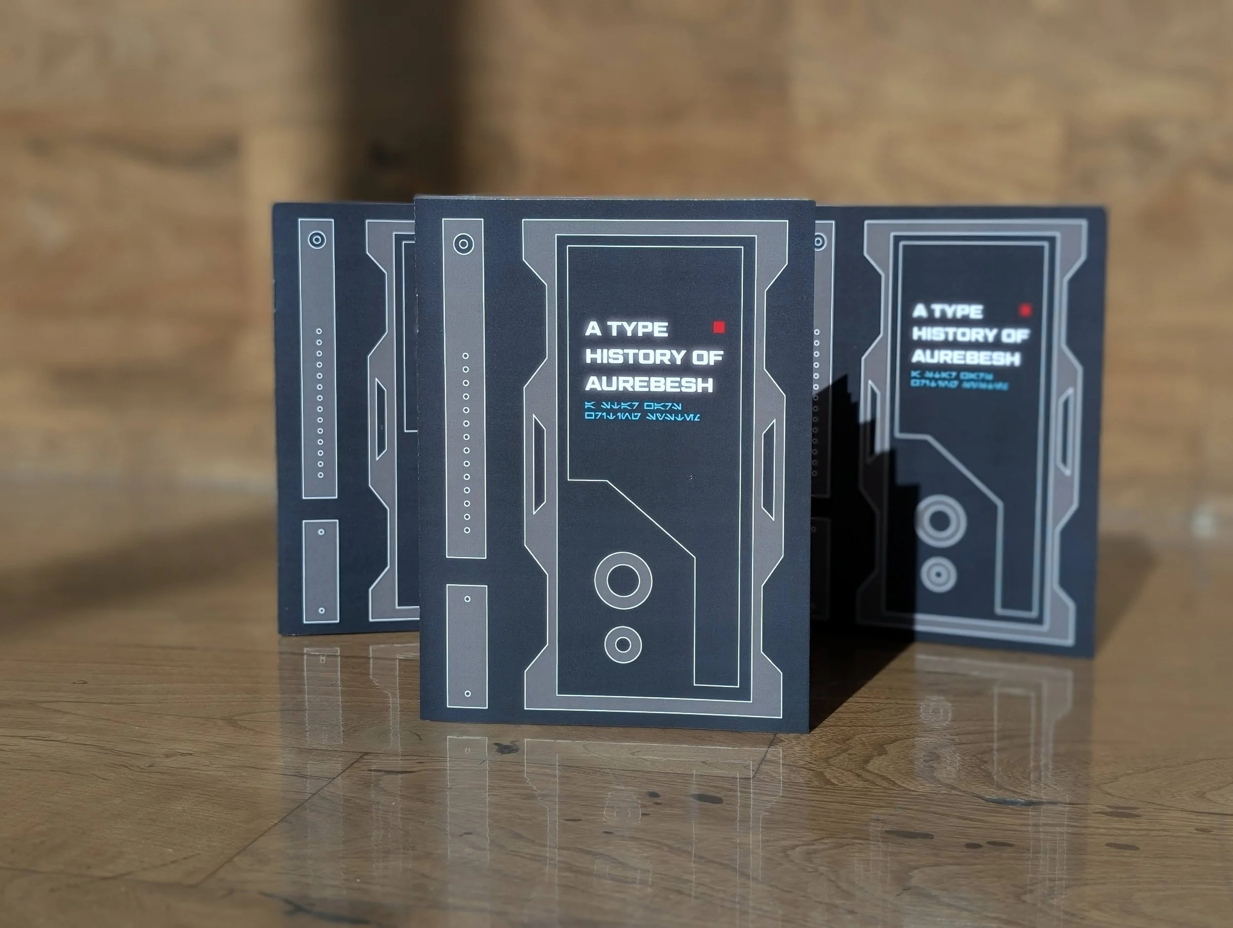
For Typography I, I made a book that was a focused type study on the Star Wars writing system, Aurebesh. I completed the process from start to finish—researching, writing, designing, printing, and binding everything ourselves.
see the final book!
behind the scenes
At the beginning of this project, I had to choose a topic that I would have to work with for 5 weeks. Luckily, it was a pretty easy decision because I love Star Wars, so naturally I had to work in a galaxy far, far away. Initially, I was unsure about how broad I should go: should I talk about the iconic Star Wars logo, or should I zoom in closer and do something more niche?
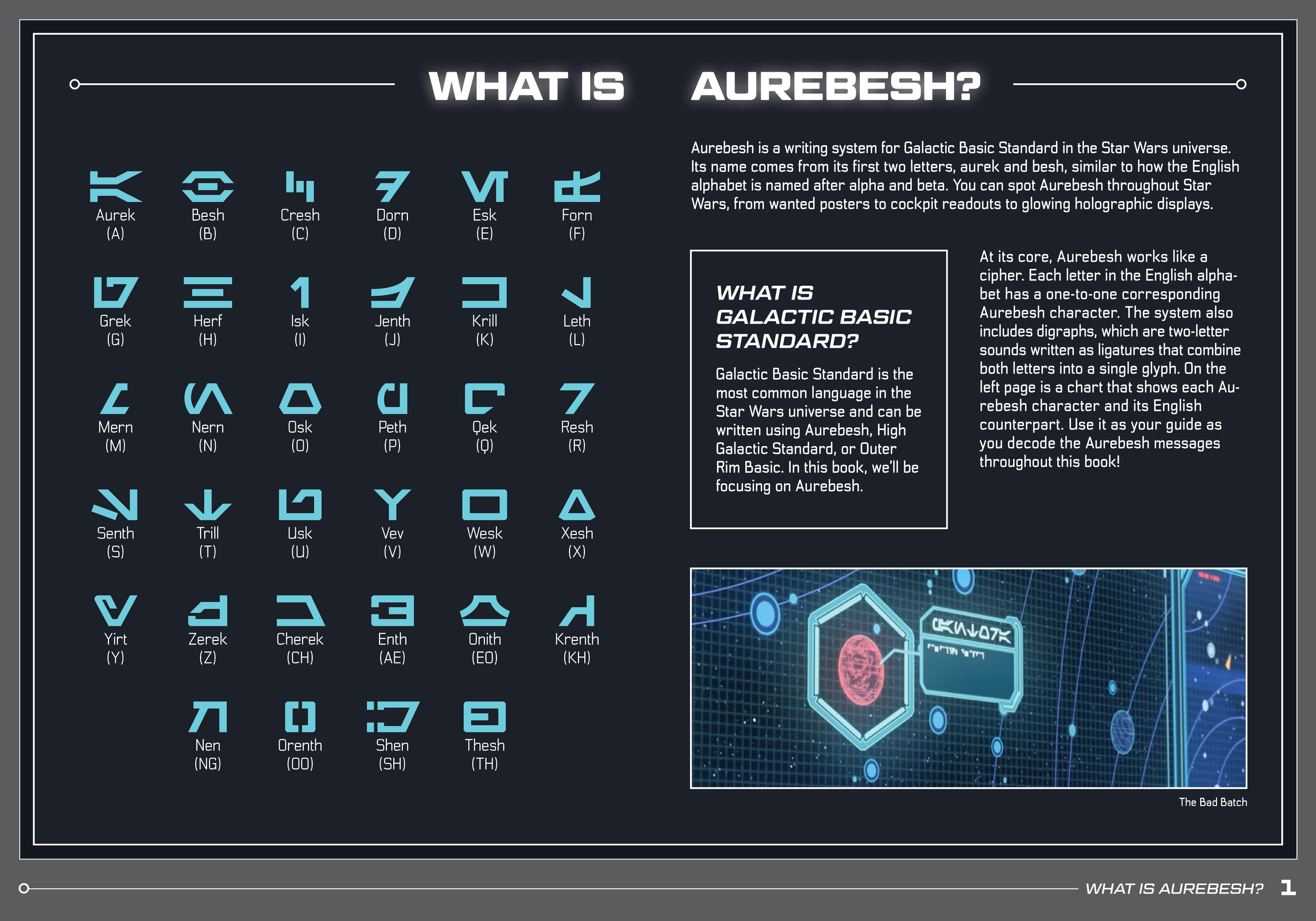
…I’m assuming most of you don’t know what Aurebesh is and have deduced that I went with option two ;).
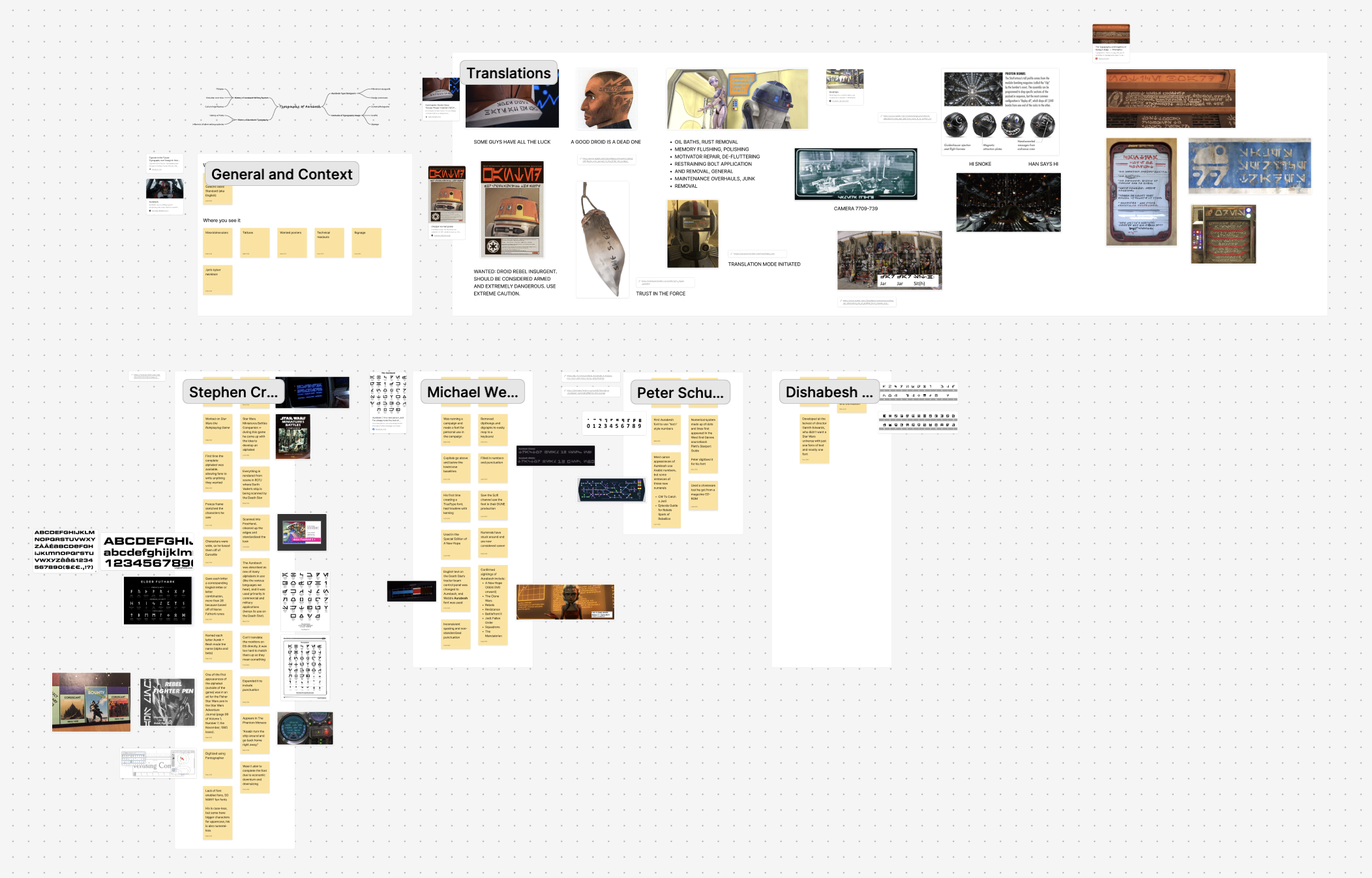
My research
how to bind?
I picked my binding method early on. I decided to staple bind because I imagined that this book would be the type of thing to be handed out at Comic-Con or Star Wars Celebration—and therefore would have to be easily mass produced.
organizing content
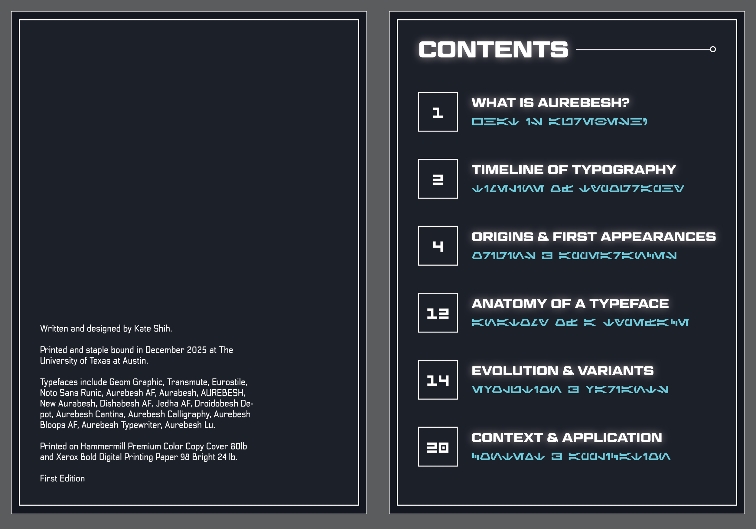
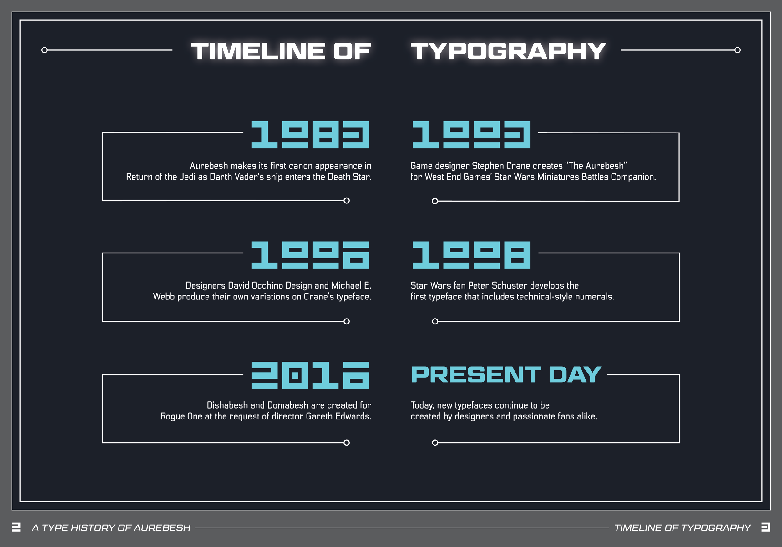
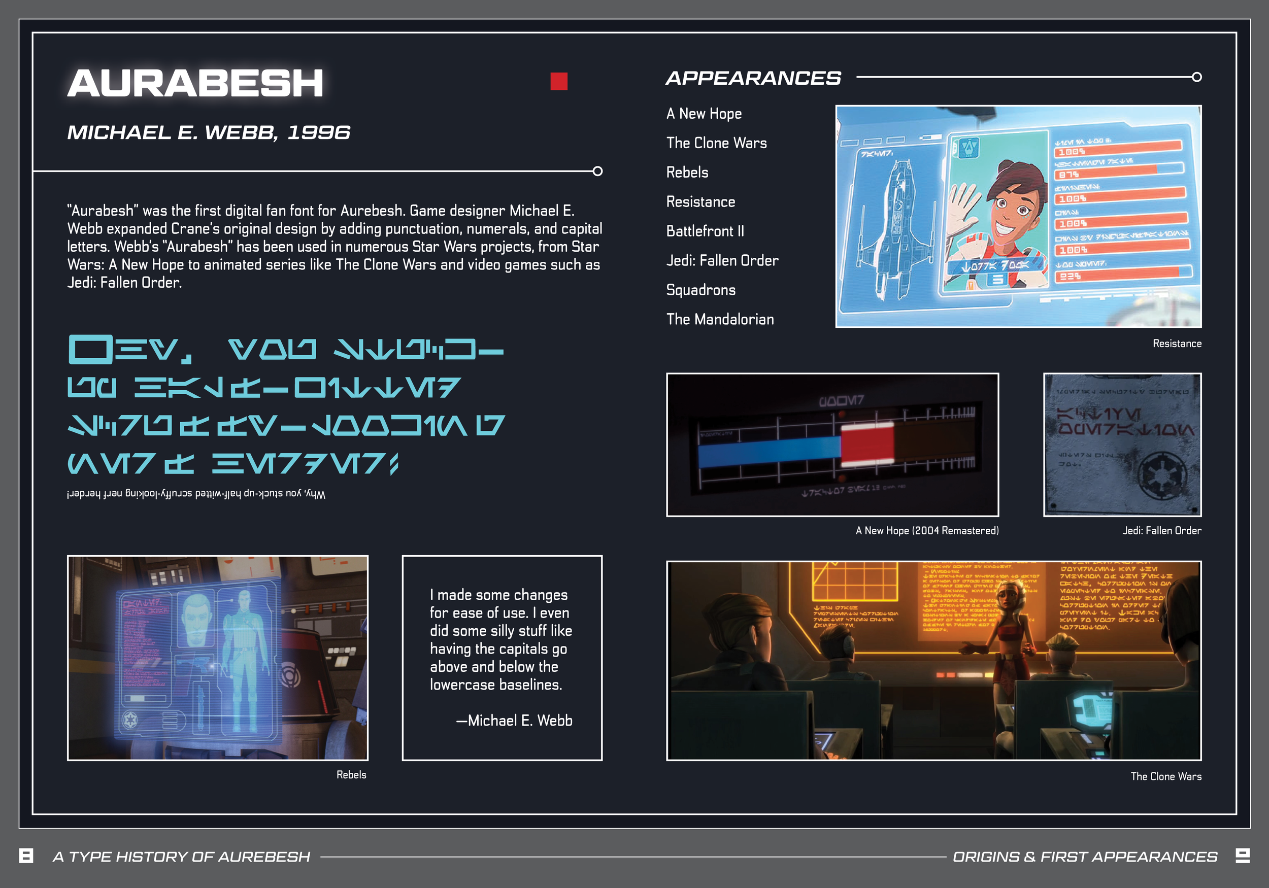
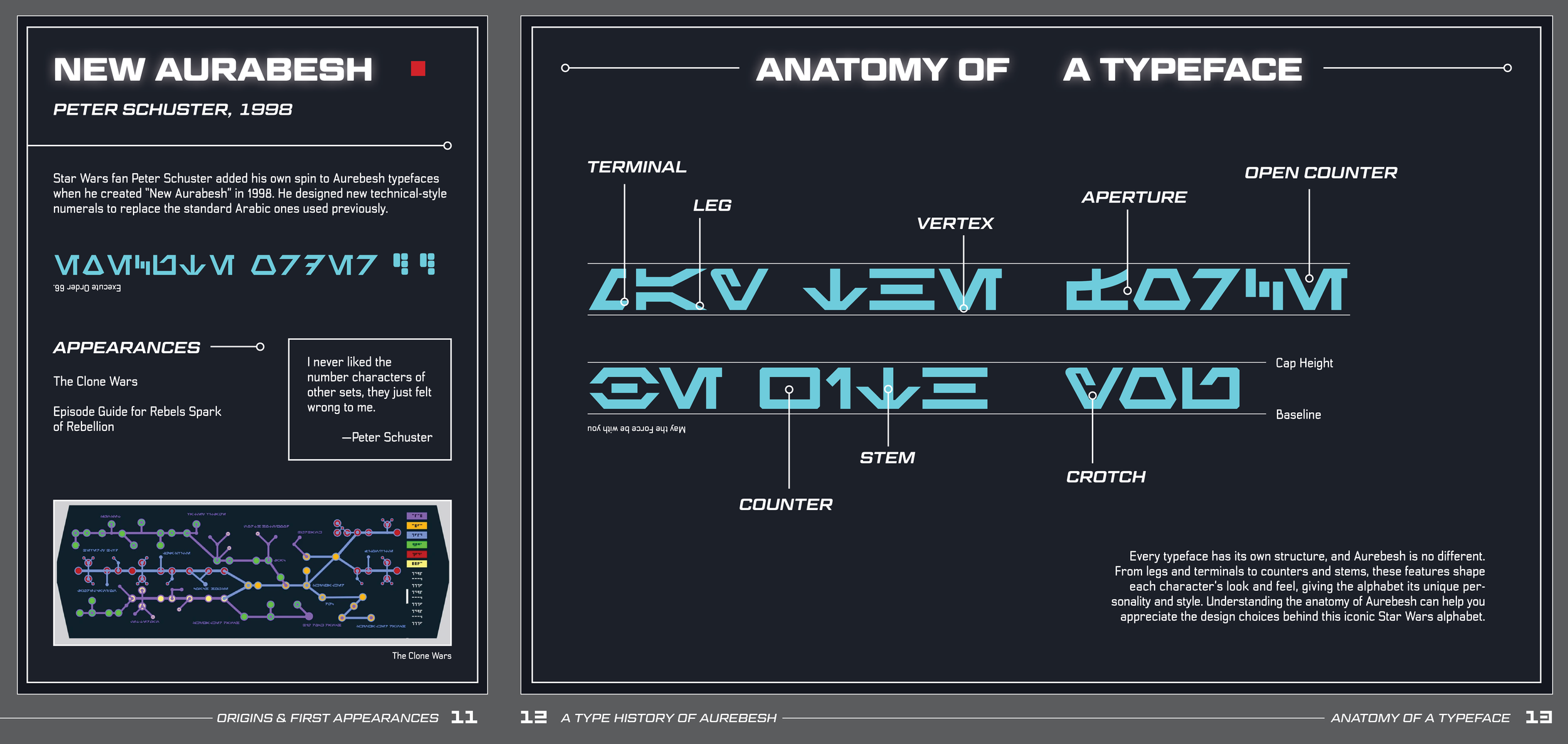
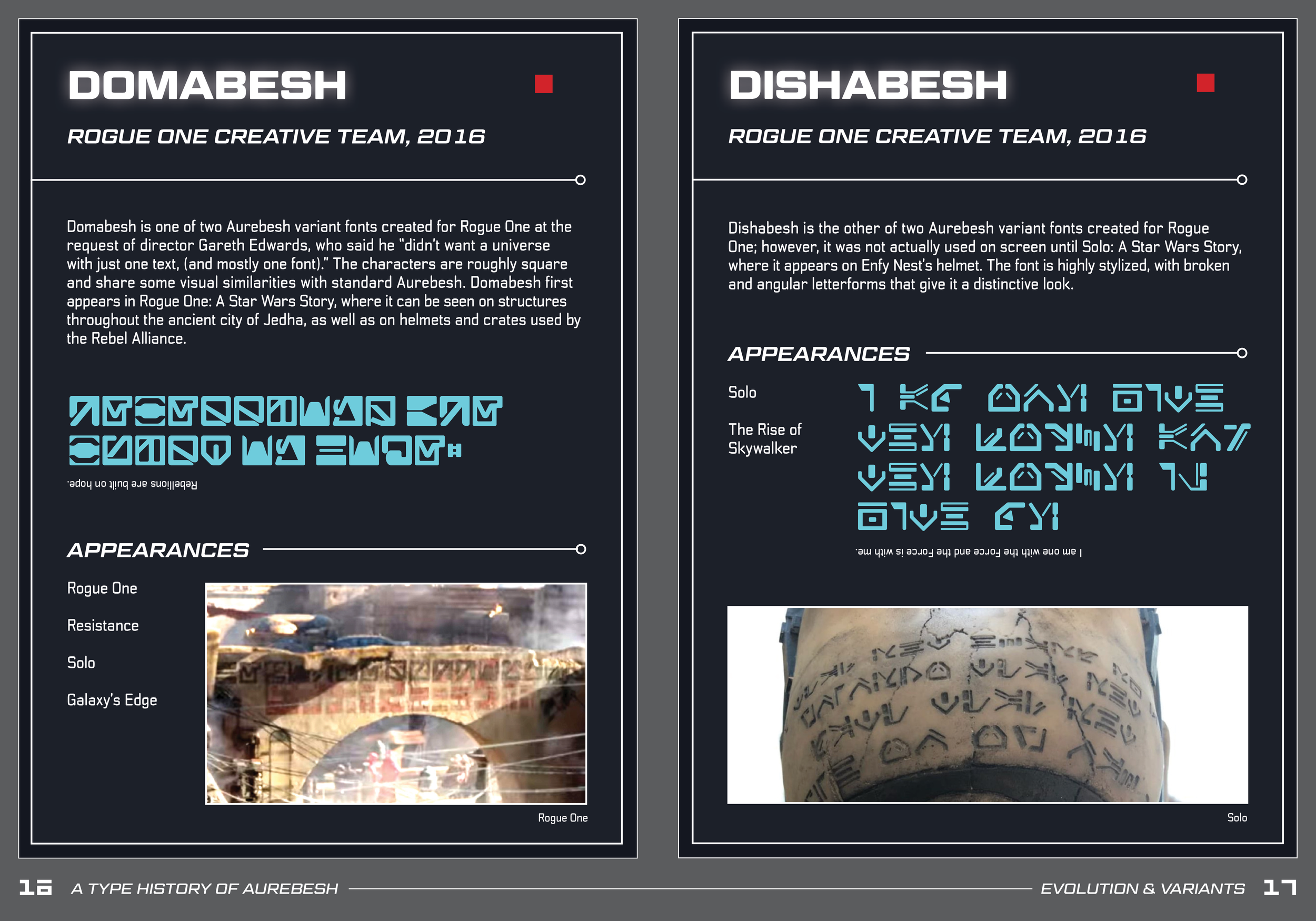
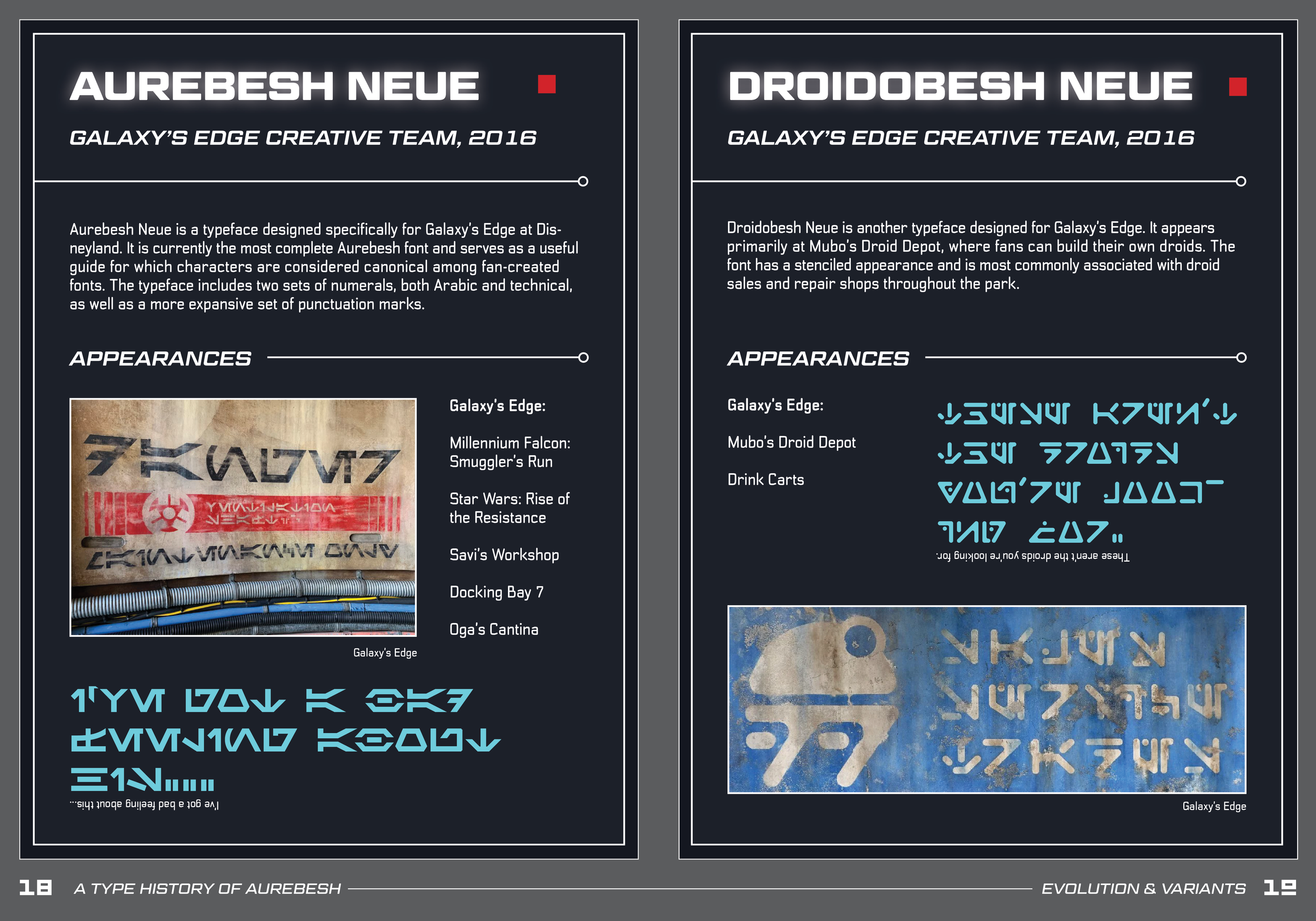
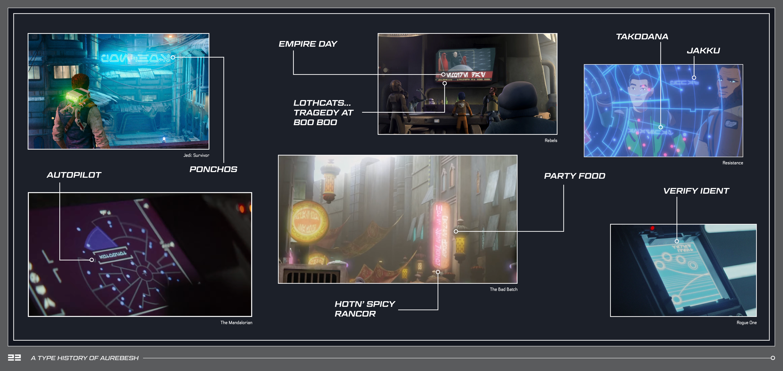
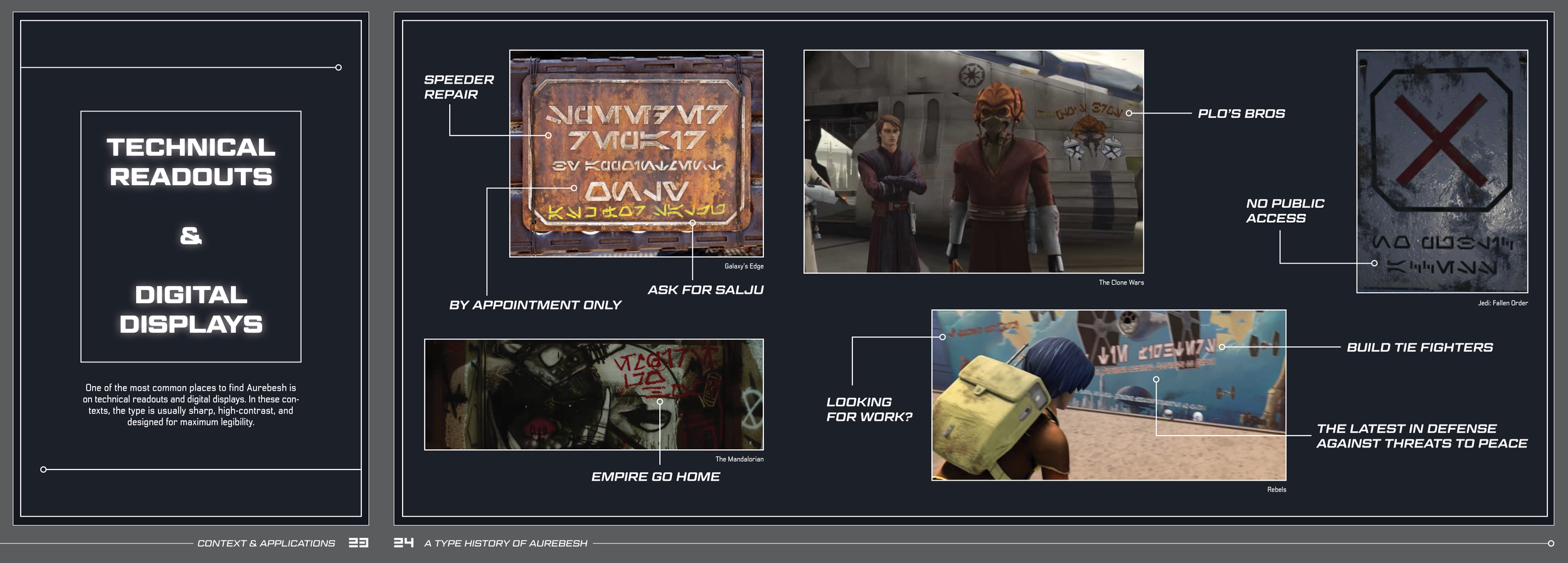
I decided to break up the book into a timeline with three main sections: first appearances/origins, evolution/variants, and contexts/applications. Additionally, I wanted to introduced what Aurebesh was, show a full, zoomed out timeline, and include a typographic anatomy diagram. I then made a book dummy to further help me layout the sections and make sure that it fit my intended saddle-stitch method, and gave pages that I foresaw would have many photos gatefolds.
an exciting development
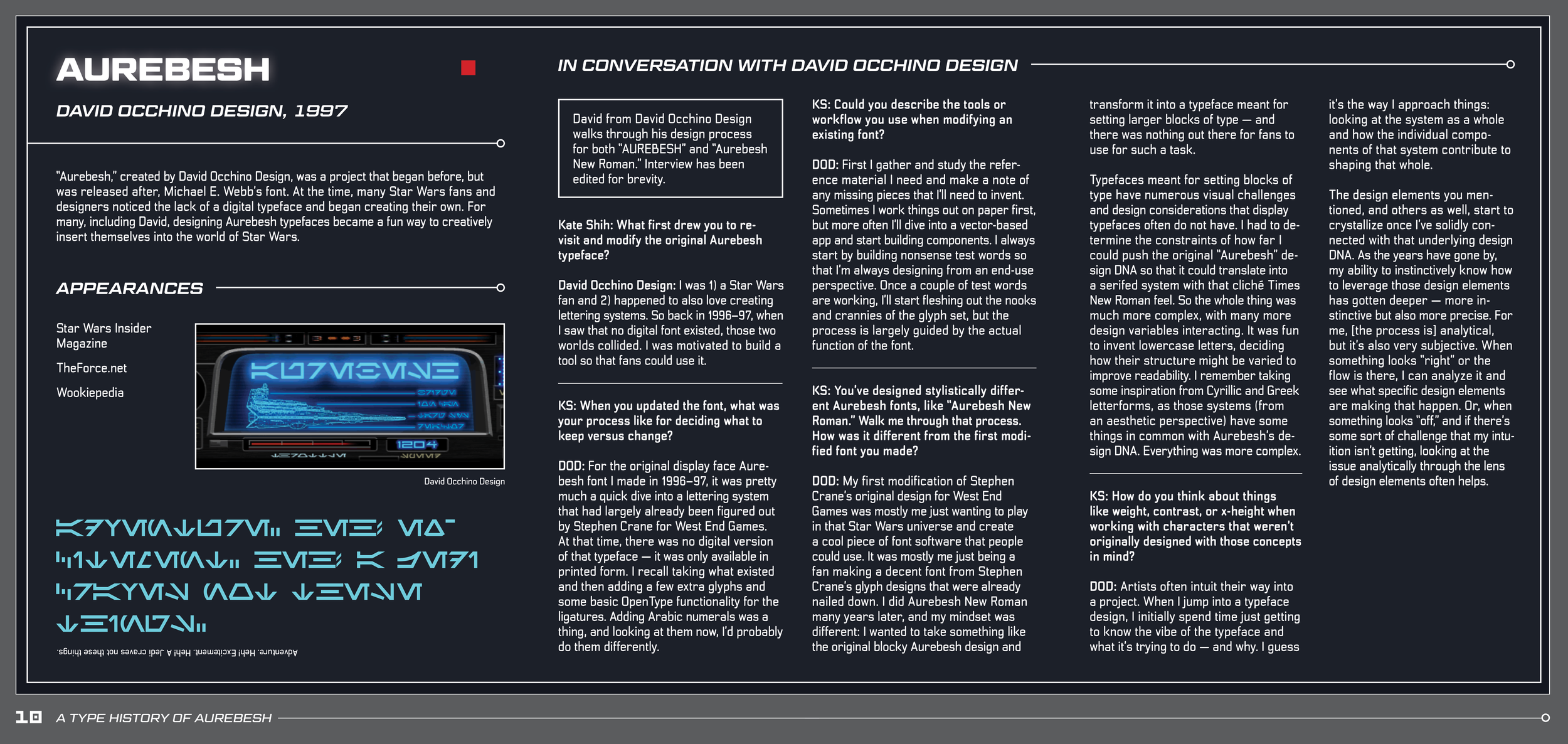
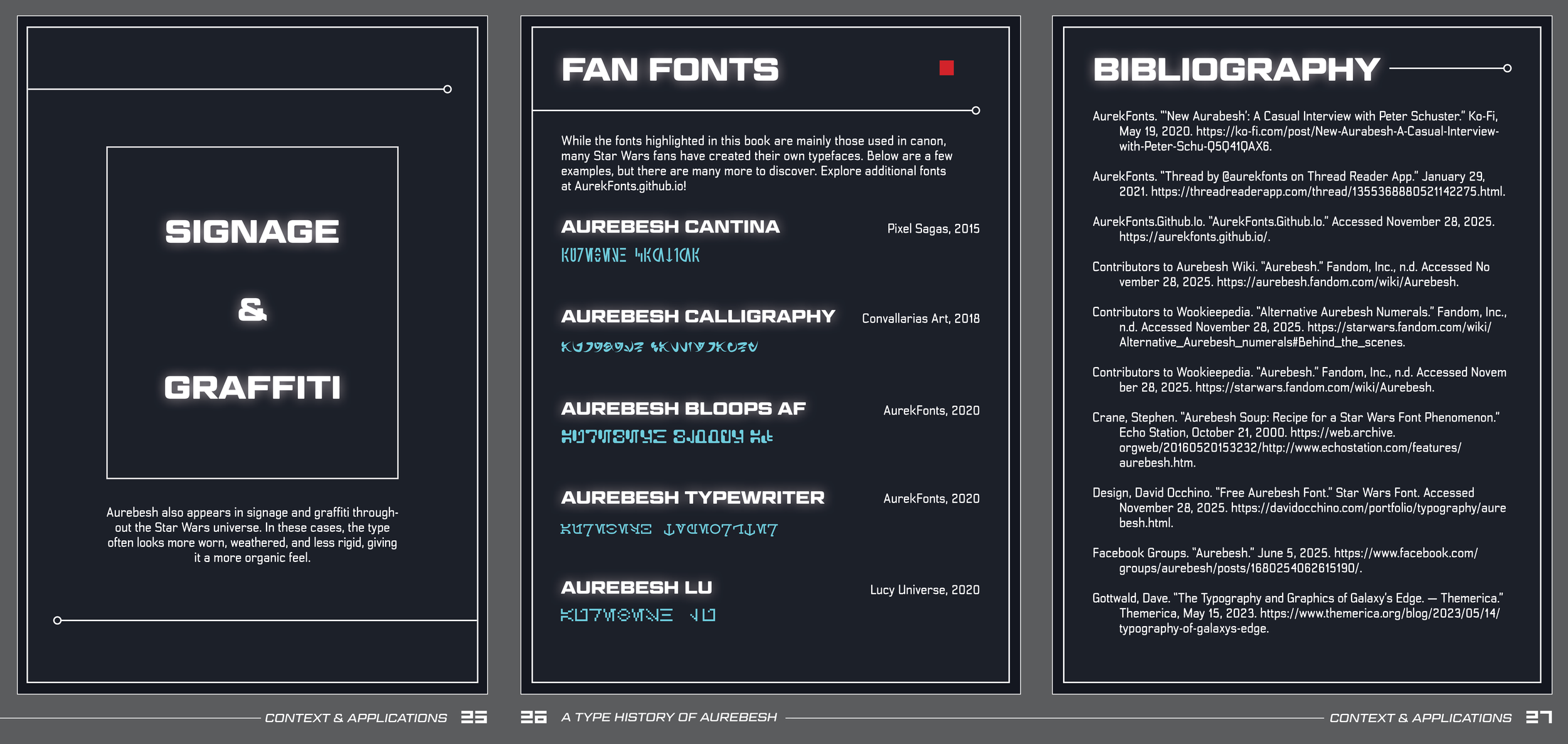
As I was getting ready to start designing, I received an email from an Aurebesh type designer who I had contacted weeks prior saying that he would be happy to answer my questions! David from David Occhino Design was awesome, and I learned a lot from him.
choosing typefaces and colors
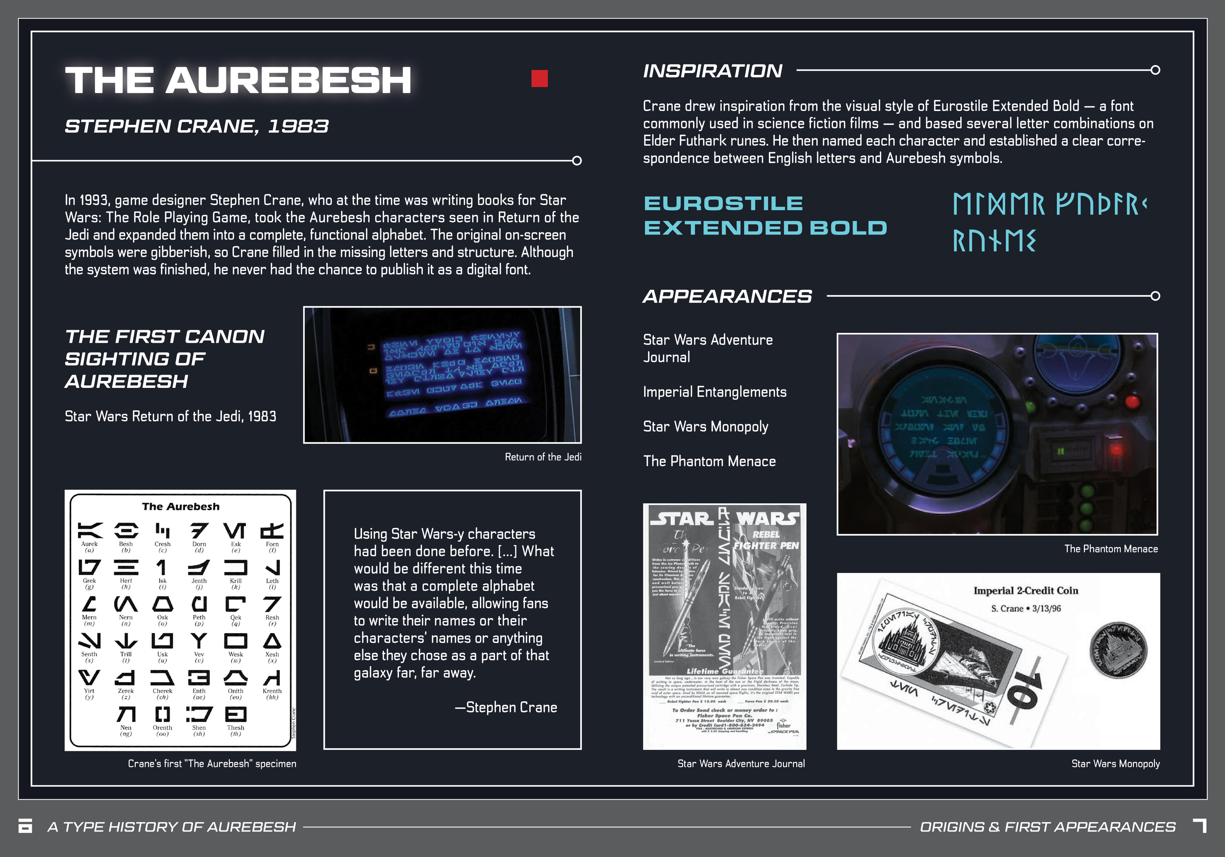
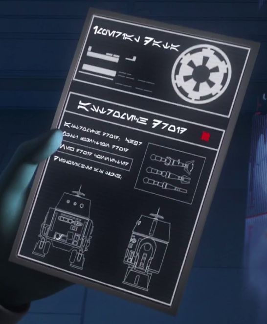
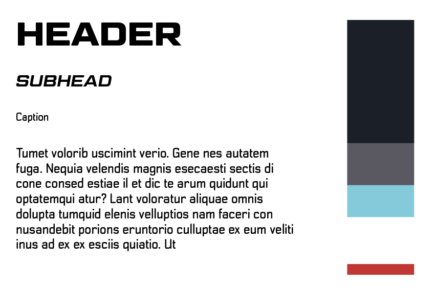
Because I knew that I wanted my layout to look like a datapad, I had to pick typefaces that would the theme. My first thought was Eurostile because that was what the original Aurebesh typeface was based off of; however, I felt that choice was a little too on the nose and didn’t love how it looked. I ended up settling on Geom Graphic Bold (all uppercase) for my headers and Transmute for my body text. These fonts felt science fiction and unique enough for my spreads.
I also knew that I was going to try and include the actual font on their featured pages if I could. So, I quickly gathered those files as well.
For colors, I eye-dropped the colors from my reference photo and also decided on the ratio that they would show up in my book.
My visual inspiration
My style guide
printing, and cutting, and binding…oh my!
…wait wrong franchise.
I printed all my pages with a Laserjet printer and cut them. I folded my pages using a bone folder and then nested them with the cover. Lastly, I used the staple binder to secure everything in place.